Description
Used to define an UpDown control in a form.
Diagram
Overview
 |
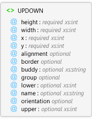
UPDOWN
Used to define an UpDown control in a form.
 |
height required xs:int
The height of the control.
|
|
width required xs:int
The width of the control.
|
|
x required xs:int
The x coordinate of the upper left corner of the control.
|
|
y required xs:int
The y coordinate of the upper left corner of the control
|
|
alignment optional Restriction of xs:string
The alignment of the control with respect to its buddy control.
|
|
border optional Restriction of xs:string
Specifies whether the control has a border.
|
|
buddy optional xs:string
The Edit control that is associated with the Slider control.
|
|
group optional Restriction of xs:string
Specifies whether the control starts a new group of controls.
|
|
lower optional xs:int
The minimum number in the range of the control.
|
|
name optional xs:string
Name of the UpDown control. Used to reference the control in scripts.
|
|
orientation optional Restriction of xs:string
The alignment of the control with respect to its buddy control.
|
|
upper optional xs:int
The maximum number in the range of the control.
|
|
Attributes
| Name | Type | Use | Default | Fixed | Description |
|---|
| height | xs:int | required | | | The height of the control. |
| width | xs:int | required | | | The width of the control. |
| x | xs:int | required | | | The x coordinate of the upper left corner of the control. |
| y | xs:int | required | | | The y coordinate of the upper left corner of the control |
| alignment | Restriction of xs:string | optional | left | | The alignment of the control with respect to its buddy control. |
| border | Restriction of xs:string | optional | false | | Specifies whether the control has a border. |
| buddy | xs:string | optional | | | The Edit control that is associated with the Slider control. |
| group | Restriction of xs:string | optional | false | | Specifies whether the control starts a new group of controls. |
| lower | xs:int | optional | | | The minimum number in the range of the control. |
| name | xs:string | optional | | | Name of the UpDown control. Used to reference the control in scripts. |
| orientation | Restriction of xs:string | optional | vert | | The alignment of the control with respect to its buddy control. |
| upper | xs:int | optional | | | The maximum number in the range of the control. |
Examples
ArcPad layer file (*.apl) with an edit form.
Source
<xs:element name="UPDOWN" xmlns:xs="http://www.w3.org/2001/XMLSchema">
  <xs:annotation>
    <xs:documentation>Used to define an UpDown control in a form.</xs:documentation>
  </xs:annotation>
  <xs:complexType>
    <xs:attribute use="required" name="height" type="xs:int">
      <xs:annotation>
        <xs:documentation>The height of the control.</xs:documentation>
      </xs:annotation>
    </xs:attribute>
    <xs:attribute use="required" name="width" type="xs:int">
      <xs:annotation>
        <xs:documentation>The width of the control.</xs:documentation>
      </xs:annotation>
    </xs:attribute>
    <xs:attribute name="x" type="xs:int" use="required">
      <xs:annotation>
        <xs:documentation>The x coordinate of the upper left corner of the control.</xs:documentation>
      </xs:annotation>
    </xs:attribute>
    <xs:attribute name="y" type="xs:int" use="required">
      <xs:annotation>
        <xs:documentation>The y coordinate of the upper left corner of the control</xs:documentation>
      </xs:annotation>
    </xs:attribute>
    <xs:attribute default="left" name="alignment">
      <xs:annotation>
        <xs:documentation>The alignment of the control with respect to its buddy control.</xs:documentation>
      </xs:annotation>
      <xs:simpleType>
        <xs:restriction base="xs:string">
          <xs:enumeration value="left" />
          <xs:enumeration value="center" />
          <xs:enumeration value="right" />
        </xs:restriction>
      </xs:simpleType>
    </xs:attribute>
    <xs:attribute default="false" name="border">
      <xs:annotation>
        <xs:documentation>Specifies whether the control has a border.</xs:documentation>
      </xs:annotation>
      <xs:simpleType>
        <xs:restriction base="xs:string">
          <xs:enumeration value="true" />
          <xs:enumeration value="false" />
        </xs:restriction>
      </xs:simpleType>
    </xs:attribute>
    <xs:attribute name="buddy" type="xs:string">
      <xs:annotation>
        <xs:documentation>The Edit control that is associated with the Slider control.</xs:documentation>
      </xs:annotation>
    </xs:attribute>
    <xs:attribute default="false" name="group">
      <xs:annotation>
        <xs:documentation>Specifies whether the control starts a new group of controls.</xs:documentation>
      </xs:annotation>
      <xs:simpleType>
        <xs:restriction base="xs:string">
          <xs:enumeration value="" />
          <xs:enumeration value="true" />
          <xs:enumeration value="false" />
        </xs:restriction>
      </xs:simpleType>
    </xs:attribute>
    <xs:attribute name="lower" type="xs:int">
      <xs:annotation>
        <xs:documentation>The minimum number in the range of the control.</xs:documentation>
      </xs:annotation>
    </xs:attribute>
    <xs:attribute name="name" type="xs:string">
      <xs:annotation>
        <xs:documentation>Name of the UpDown control. Used to reference the control in scripts.</xs:documentation>
      </xs:annotation>
    </xs:attribute>
    <xs:attribute default="vert" name="orientation">
      <xs:annotation>
        <xs:documentation>The alignment of the control with respect to its buddy control.</xs:documentation>
      </xs:annotation>
      <xs:simpleType>
        <xs:restriction base="xs:string">
          <xs:enumeration value="horiz" />
          <xs:enumeration value="vert" />
        </xs:restriction>
      </xs:simpleType>
    </xs:attribute>
    <xs:attribute name="upper" type="xs:int">
      <xs:annotation>
        <xs:documentation>The maximum number in the range of the control.</xs:documentation>
      </xs:annotation>
    </xs:attribute>
  </xs:complexType>
</xs:element> |
See Also