Description
Used to define a DateTime control in a form.
Diagram
Overview
 |
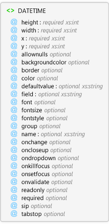
DATETIME
Used to define a DateTime control in a form.
 |
height required xs:int
The height of the control.
|
|
width required xs:int
The width of the control
|
|
x required xs:int
The x coordinate of the upper left corner of the control
|
|
y required xs:int
The y coordinate of the upper left corner of the conrol
|
|
allownulls optional Restriction of xs:string
Specifies whether the control can accept a null value.
|
|
backgroundcolor optional
The background color to use for the control. If not specified, this value is inherited from the page's backgroundcolor attribute.
|
|
border optional Restriction of xs:string
Specifies whether the control has a border.
|
|
color optional
The color to use for the controls text. If not specified, this value is inherited from the page's color attribute.
|
|
defaultvalue optional xs:string
A simple expression that specifies the default value of the control.
|
|
field optional xs:string
The field of the shapefile's DBF table that is linked to the control.
|
|
font optional
The font to use for the control's text. If not specified, this value is inherited from the page's font attribute.
|
|
fontsize optional Restriction of xs:int
The font size to use for the control's text. If not specified, this value is inherited from the page's fontsize attribute.
|
|
fontstyle optional Restriction of xs:string
The font style to use for the control's text. If not specified, this value is inherited from the page's fontstyle attribute. If the value is not regular, it can be any combination of other values, expressed as a comma delimited list (for example, fontstyle="bold,underline").
|
|
group optional Restriction of xs:string
Specifies whether the control starts a new group of controls.
|
|
name optional xs:string
Name of the DateTime control. Used to reference the control in scripts.
|
|
onchange optional
Specify the script to run when this event occurs.
|
|
oncloseup optional
Specify the script to run when this event occurs.
|
|
ondropdown optional
Specify the script to run when this event occurs.
|
|
onkillfocus optional
Specify the script to run when this event occurs.
|
|
onsetfocus optional
Specify the script to run when this event occurs.
|
|
onvalidate optional
Specify the script to run when this event occurs.
|
|
readonly optional Restriction of xs:string
Specifies whether the control's value can be modified by the user.
|
|
required optional Restriction of xs:string
Specifies if the user must enter some text in the control
|
|
sip optional Restriction of xs:string
Specifies if the SIP (soft input panel) is displayed on pen devices when the control gets the focus.
|
|
tabstop optional Restriction of xs:string
Specifies whether the TAB key can be used to move the focus to the control.
|
|
Attributes
| Name | Type | Use | Default | Fixed | Description |
|---|
| height | xs:int | required | | | The height of the control. |
| width | xs:int | required | | | The width of the control |
| x | xs:int | required | | | The x coordinate of the upper left corner of the control |
| y | xs:int | required | | | The y coordinate of the upper left corner of the conrol |
| allownulls | Restriction of xs:string | optional | false | | Specifies whether the control can accept a null value. |
| backgroundcolor | | optional | | | The background color to use for the control. If not specified, this value is inherited from the page's backgroundcolor attribute. |
| border | Restriction of xs:string | optional | false | | Specifies whether the control has a border. |
| color | | optional | | | The color to use for the controls text. If not specified, this value is inherited from the page's color attribute. |
| defaultvalue | xs:string | optional | | | A simple expression that specifies the default value of the control. |
| field | xs:string | optional | | | The field of the shapefile's DBF table that is linked to the control. |
| font | | optional | | | The font to use for the control's text. If not specified, this value is inherited from the page's font attribute. |
| fontsize | Restriction of xs:int | optional | | | The font size to use for the control's text. If not specified, this value is inherited from the page's fontsize attribute. |
| fontstyle | Restriction of xs:string | optional | regular | | The font style to use for the control's text. If not specified, this value is inherited from the page's fontstyle attribute. If the value is not regular, it can be any combination of other values, expressed as a comma delimited list (for example, fontstyle="bold,underline"). |
| group | Restriction of xs:string | optional | false | | Specifies whether the control starts a new group of controls. |
| name | xs:string | optional | | | Name of the DateTime control. Used to reference the control in scripts. |
| onchange | | optional | | | Specify the script to run when this event occurs. |
| oncloseup | | optional | | | Specify the script to run when this event occurs. |
| ondropdown | | optional | | | Specify the script to run when this event occurs. |
| onkillfocus | | optional | | | Specify the script to run when this event occurs. |
| onsetfocus | | optional | | | Specify the script to run when this event occurs. |
| onvalidate | | optional | | | Specify the script to run when this event occurs. |
| readonly | Restriction of xs:string | optional | false | | Specifies whether the control's value can be modified by the user. |
| required | Restriction of xs:string | optional | false | | Specifies if the user must enter some text in the control |
| sip | Restriction of xs:string | optional | auto | | Specifies if the SIP (soft input panel) is displayed on pen devices when the control gets the focus. |
| tabstop | Restriction of xs:string | optional | true | | Specifies whether the TAB key can be used to move the focus to the control. |
Examples
ArcPad layer file (*.apl) with an edit form.
Restrictions
The following attributes can only be used in edit and identify forms. They cannot be used in general forms:; field; required
Source
<xs:element name="DATETIME" xmlns:xs="http://www.w3.org/2001/XMLSchema">
  <xs:annotation>
    <xs:documentation>Used to define a DateTime control in a form.</xs:documentation>
  </xs:annotation>
  <xs:complexType>
    <xs:attribute use="required" name="height" type="xs:int">
      <xs:annotation>
        <xs:documentation>The height of the control.</xs:documentation>
      </xs:annotation>
    </xs:attribute>
    <xs:attribute use="required" name="width" type="xs:int">
      <xs:annotation>
        <xs:documentation>The width of the control</xs:documentation>
      </xs:annotation>
    </xs:attribute>
    <xs:attribute name="x" type="xs:int" use="required">
      <xs:annotation>
        <xs:documentation>The x coordinate of the upper left corner of the control</xs:documentation>
      </xs:annotation>
    </xs:attribute>
    <xs:attribute name="y" type="xs:int" use="required">
      <xs:annotation>
        <xs:documentation>The y coordinate of the upper left corner of the conrol</xs:documentation>
      </xs:annotation>
    </xs:attribute>
    <xs:attribute default="false" name="allownulls">
      <xs:annotation>
        <xs:documentation>Specifies whether the control can accept a null value.</xs:documentation>
      </xs:annotation>
      <xs:simpleType>
        <xs:restriction base="xs:string">
          <xs:enumeration value="true" />
          <xs:enumeration value="false" />
        </xs:restriction>
      </xs:simpleType>
    </xs:attribute>
    <xs:attribute name="backgroundcolor">
      <xs:annotation>
        <xs:documentation>The background color to use for the control. If not specified, this value is inherited from the page's backgroundcolor attribute.</xs:documentation>
      </xs:annotation>
    </xs:attribute>
    <xs:attribute default="false" name="border">
      <xs:annotation>
        <xs:documentation>Specifies whether the control has a border.</xs:documentation>
      </xs:annotation>
      <xs:simpleType>
        <xs:restriction base="xs:string">
          <xs:enumeration value="true" />
          <xs:enumeration value="false" />
        </xs:restriction>
      </xs:simpleType>
    </xs:attribute>
    <xs:attribute name="color">
      <xs:annotation>
        <xs:documentation>The color to use for the controls text. If not specified, this value is inherited from the page's color attribute.</xs:documentation>
      </xs:annotation>
    </xs:attribute>
    <xs:attribute name="defaultvalue" type="xs:string">
      <xs:annotation>
        <xs:documentation>A simple expression that specifies the default value of the control.</xs:documentation>
      </xs:annotation>
    </xs:attribute>
    <xs:attribute name="field" type="xs:string">
      <xs:annotation>
        <xs:documentation>The field of the shapefile's DBF table that is linked to the control.</xs:documentation>
      </xs:annotation>
    </xs:attribute>
    <xs:attribute name="font">
      <xs:annotation>
        <xs:documentation>The font to use for the control's text. If not specified, this value is inherited from the page's font attribute.</xs:documentation>
      </xs:annotation>
    </xs:attribute>
    <xs:attribute name="fontsize">
      <xs:annotation>
        <xs:documentation>The font size to use for the control's text. If not specified, this value is inherited from the page's fontsize attribute.</xs:documentation>
      </xs:annotation>
      <xs:simpleType>
        <xs:restriction base="xs:int">
          <xs:minInclusive value="1" />
        </xs:restriction>
      </xs:simpleType>
    </xs:attribute>
    <xs:attribute default="regular" name="fontstyle">
      <xs:annotation>
        <xs:documentation>The font style to use for the control's text. If not specified, this value is inherited from the page's fontstyle attribute. If the value is not regular, it can be any combination of other values, expressed as a comma delimited list (for example, fontstyle="bold,underline").</xs:documentation>
      </xs:annotation>
      <xs:simpleType>
        <xs:restriction base="xs:string">
          <xs:enumeration value="regular" />
          <xs:enumeration value="bold" />
          <xs:enumeration value="italic" />
          <xs:enumeration value="underline" />
          <xs:enumeration value="strikeout" />
        </xs:restriction>
      </xs:simpleType>
    </xs:attribute>
    <xs:attribute default="false" name="group">
      <xs:annotation>
        <xs:documentation>Specifies whether the control starts a new group of controls.</xs:documentation>
      </xs:annotation>
      <xs:simpleType>
        <xs:restriction base="xs:string">
          <xs:enumeration value="true" />
          <xs:enumeration value="false" />
        </xs:restriction>
      </xs:simpleType>
    </xs:attribute>
    <xs:attribute name="name" type="xs:string">
      <xs:annotation>
        <xs:documentation>Name of the DateTime control. Used to reference the control in scripts.</xs:documentation>
      </xs:annotation>
    </xs:attribute>
    <xs:attribute name="onchange">
      <xs:annotation>
        <xs:documentation>Specify the script to run when this event occurs.</xs:documentation>
      </xs:annotation>
    </xs:attribute>
    <xs:attribute name="oncloseup">
      <xs:annotation>
        <xs:documentation>Specify the script to run when this event occurs.</xs:documentation>
      </xs:annotation>
    </xs:attribute>
    <xs:attribute name="ondropdown">
      <xs:annotation>
        <xs:documentation>Specify the script to run when this event occurs.</xs:documentation>
      </xs:annotation>
    </xs:attribute>
    <xs:attribute name="onkillfocus">
      <xs:annotation>
        <xs:documentation>Specify the script to run when this event occurs.</xs:documentation>
      </xs:annotation>
    </xs:attribute>
    <xs:attribute name="onsetfocus">
      <xs:annotation>
        <xs:documentation>Specify the script to run when this event occurs.</xs:documentation>
      </xs:annotation>
    </xs:attribute>
    <xs:attribute name="onvalidate">
      <xs:annotation>
        <xs:documentation>Specify the script to run when this event occurs.</xs:documentation>
      </xs:annotation>
    </xs:attribute>
    <xs:attribute default="false" name="readonly">
      <xs:annotation>
        <xs:documentation>Specifies whether the control's value can be modified by the user.</xs:documentation>
      </xs:annotation>
      <xs:simpleType>
        <xs:restriction base="xs:string">
          <xs:enumeration value="true" />
          <xs:enumeration value="false" />
        </xs:restriction>
      </xs:simpleType>
    </xs:attribute>
    <xs:attribute default="false" name="required">
      <xs:annotation>
        <xs:documentation>Specifies if the user must enter some text in the control</xs:documentation>
      </xs:annotation>
      <xs:simpleType>
        <xs:restriction base="xs:string">
          <xs:enumeration value="true" />
          <xs:enumeration value="false" />
        </xs:restriction>
      </xs:simpleType>
    </xs:attribute>
    <xs:attribute default="auto" name="sip">
      <xs:annotation>
        <xs:documentation>Specifies if the SIP (soft input panel) is displayed on pen devices when the control gets the focus.</xs:documentation>
      </xs:annotation>
      <xs:simpleType>
        <xs:restriction base="xs:string">
          <xs:enumeration value="true" />
          <xs:enumeration value="false" />
          <xs:enumeration value="auto" />
        </xs:restriction>
      </xs:simpleType>
    </xs:attribute>
    <xs:attribute default="true" name="tabstop">
      <xs:annotation>
        <xs:documentation>Specifies whether the TAB key can be used to move the focus to the control.</xs:documentation>
      </xs:annotation>
      <xs:simpleType>
        <xs:restriction base="xs:string">
          <xs:enumeration value="true" />
          <xs:enumeration value="false" />
        </xs:restriction>
      </xs:simpleType>
    </xs:attribute>
  </xs:complexType>
</xs:element> |
See Also